Tutorial: Make a Pop-Up Form/Menu that Closes on Outside Click Using HTML, CSS, and JavaScript
Weston Huggins | 06/13/22


Weston Huggins | 06/13/22
In this article you will learn a very simple way to make a pop-up form that closes when you click outside of it (rather than using an “x” button to close). We will be using HTML, CSS, and some JavaScript. This is especially useful for things like contact forms, but can be used in a variety of situations.
You don’t need to understand every piece of this right away as it will make more sense when you look at the code, but here is a brief overview of how it all works.
We will use a button with an onclick event that calls a custom javascript function. This function toggles the class of your menu/form, making it appear on the screen. At the same time, an invisible “form background” is displayed which covers the entire page except for the form. The purpose of this is to allow the user to click anywhere outside of the form to close it. The background also has an onclick event which calls a function that closes the form and its background.
I started with the following HTML which includes the core components required for a pop-up form: the button that opens the form, the form itself, and an invisible background. It is important to start the form with a display of none so you can make it appear when the button is clicked.
<div id="form" class="form">
  <h1>This Is An Example Form</h1>
</div>
<div id="form-bg" class="form-background" onclick="closeForm()"></div>
<div id="button" class="open-form-button" onclick="openForm()">OPEN FORM</div>Next, we will look at the CSS. This mostly does some styling to make the website content look a little nicer. The parts of this code that are important for the form’s functionality include comments (/* like this */) on the same line.
.form {
  display: none; /* starts out with a display of none so it can be changed to block on click */
  background-color: rgba(193, 192, 193, .5);
  height: 80vh;
  width: 80vw;
  position: fixed;
  z-index: 2; /* will be displayed in front of background */
  top: 5vh;
  left: 0;
  right: 0;
  margin: auto;
  text-align: center;
}
.form-show {
  display: block; /* this class is added when the form button is clicked, making the form appear */
}
.open-form-button {
  background-color: lightblue;
  height: 25px;
  width: 100px;
  text-align: center;
}
.open-form-button:hover {
  cursor: pointer;
}
.form-background {
  display: none; /* starts out with display of none so it can be changed to block on click */
  position: fixed; /* stays on screen despite scroll */
  width: 100%; /* covers entire width of screen */
  height: 100%; /* covers entire height of screen */
  z-index: 1; /* will be displayed behind background */
}
The javascript code for this task is pretty simple. It uses the following two custom functions:
function openForm() {
  document.getElementById("form").classList.toggle("form-show");
  document.getElementById("form-bg").style.display = "block";
}
function closeForm() {
  document.getElementById("form").classList.toggle("form-show");
  document.getElementById("form-bg").style.display = "none";
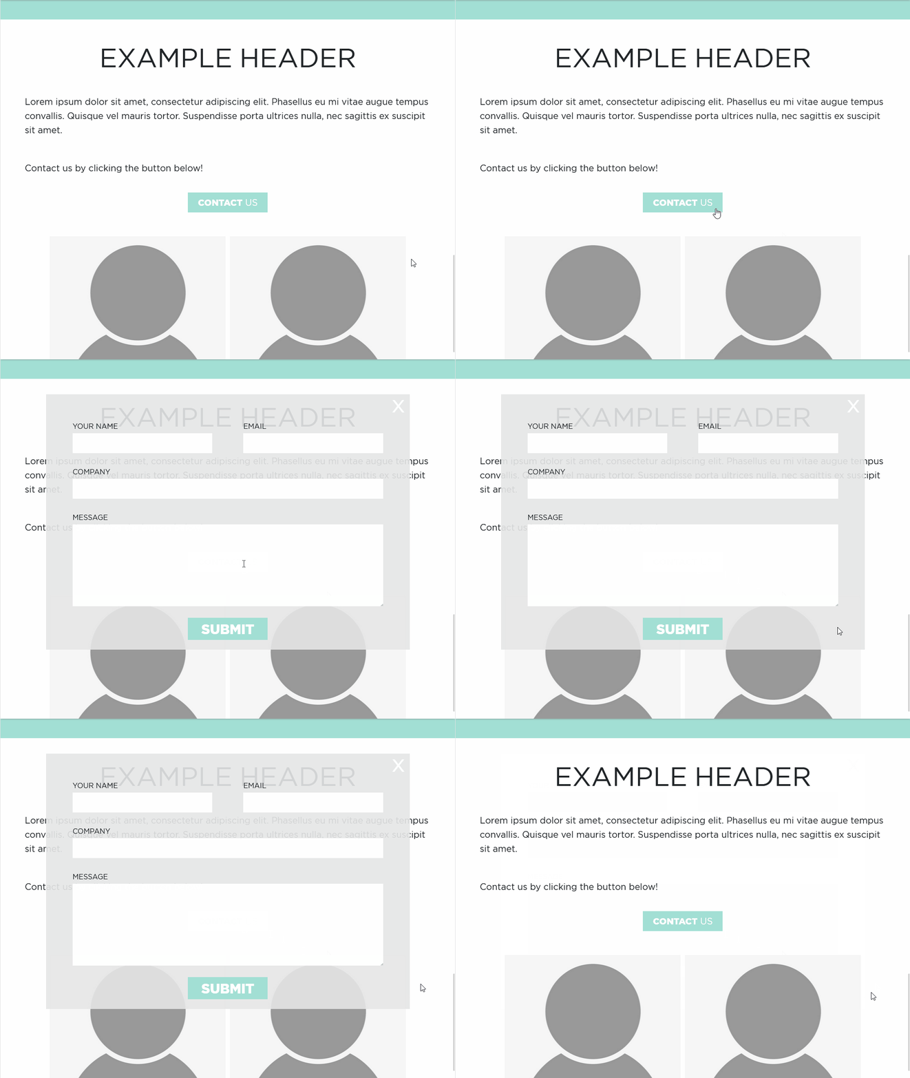
}This is how the above code functions on a webpage. As you can see, the form opens when the “OPEN FORM” button is pressed. It can then be closed by clicking anywhere on the page outside of the form.
Now that we’ve completed the basic requirements for a pop-up form, here are some more things you can do to make your components more user friendly and visually appealing:
Here is what I came up with after changing some of the code:

Thanks for reading and I hope this tutorial helped you in making an awesome website!