Single Property Websites: Our Favorite Five
Zane Huggins | 04/01/23
Zane Huggins | 04/01/23
We recently shared a list of single property websites that serve as powerful tools for agencies to lease their buildings. Since then, we have continued our research and found a lot more great websites packed with unique and engaging content that we would like to share! Ranging from short documentary-style videos to interactive stacking plans, we have done a deep dive into the branding and content delivery of these five fantastic sites:
https://www.onevanderbilt.com/
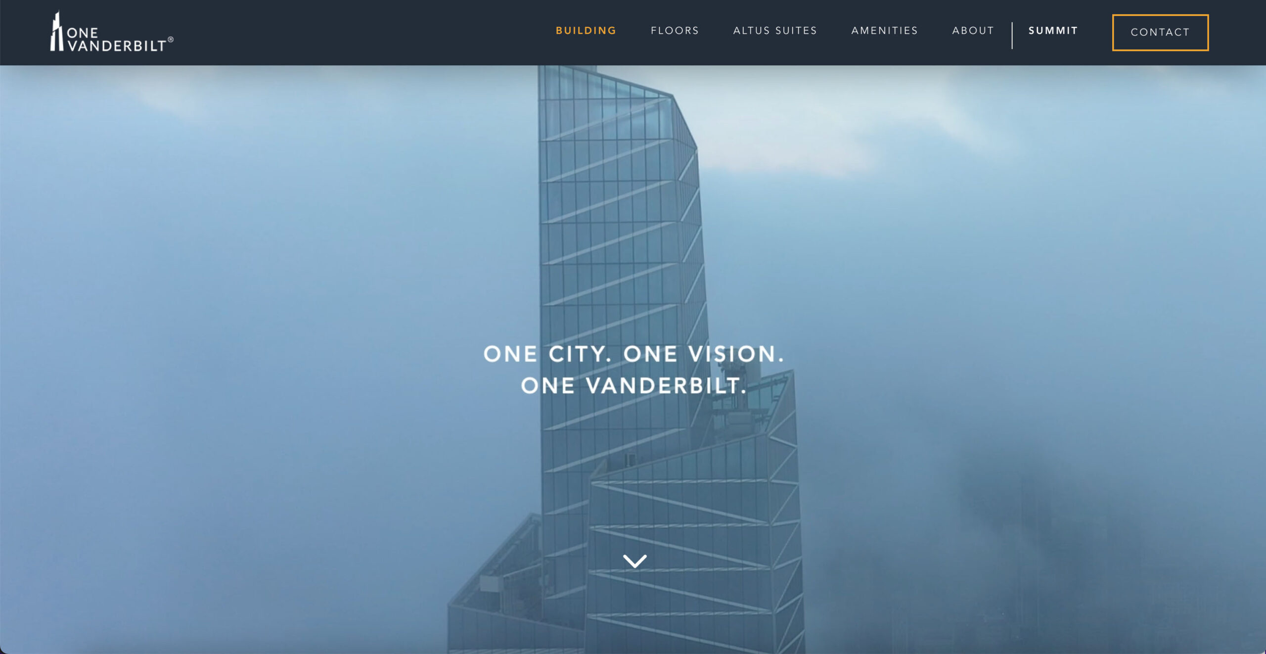
One Vanderbilt’s website features cool blue color palettes and foggy aerial footage of the property. Packed with interactive infographics and video content, this website is an excellent example of how agencies can build a digital brand experience that simultaneously informs and entertains their audience.
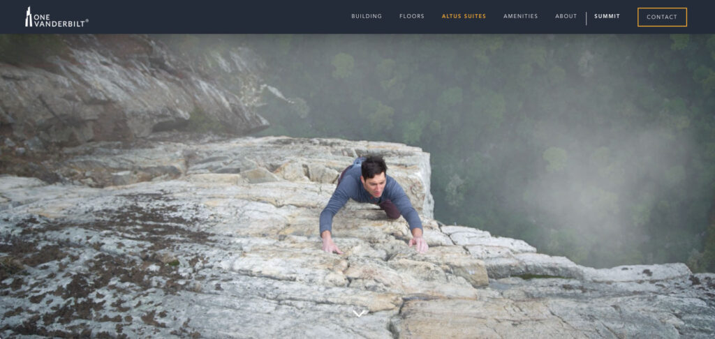
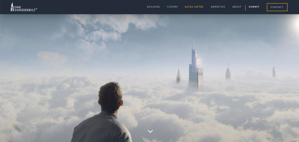
The Altus Suites page features a surrealist-style video in which a mountain climber reaches the summit (cleverly the name of One Vanderbilt’s observation deck), and turns around to see the top of the building peaking over the clouds—a testament to the height and grandiose vision the agency has for the skyscraper.
Once City. One Vision. One Vanderbilt.
The tagline, present on the home page fold, riffs off of the building’s name to further push the property’s identity as a “pinnacle of office space in Manhattan.” And while the brand basks in its self-proclaimed glory, the building has the features and amenities to back this up.
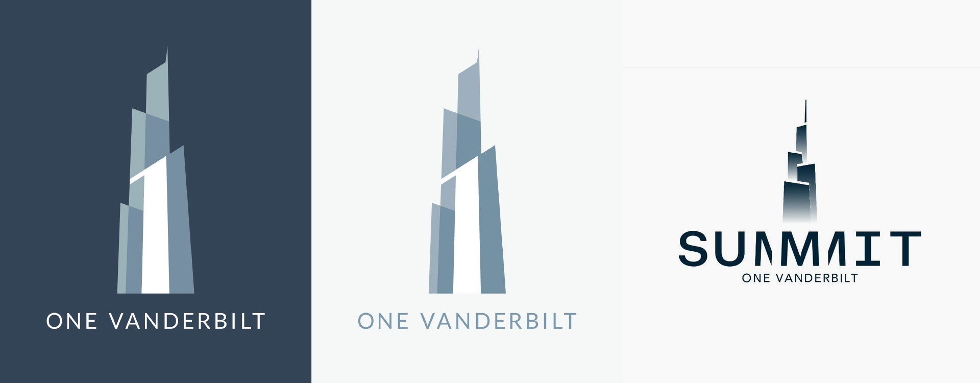
One Vanderbilt’s logo (left) is a clever, reductive-style mark that creates a sense of depth using color, and positive/negative space. And the best part, the number “1” is front and center, formed by negative space in the composition—also cleverly adding even more dimension to the mark.
Summit, the observation deck which serves as a major tourist attraction, has its own logo—which in my opinion is too similar or not different enough to make sense as a sub-mark for the identity.
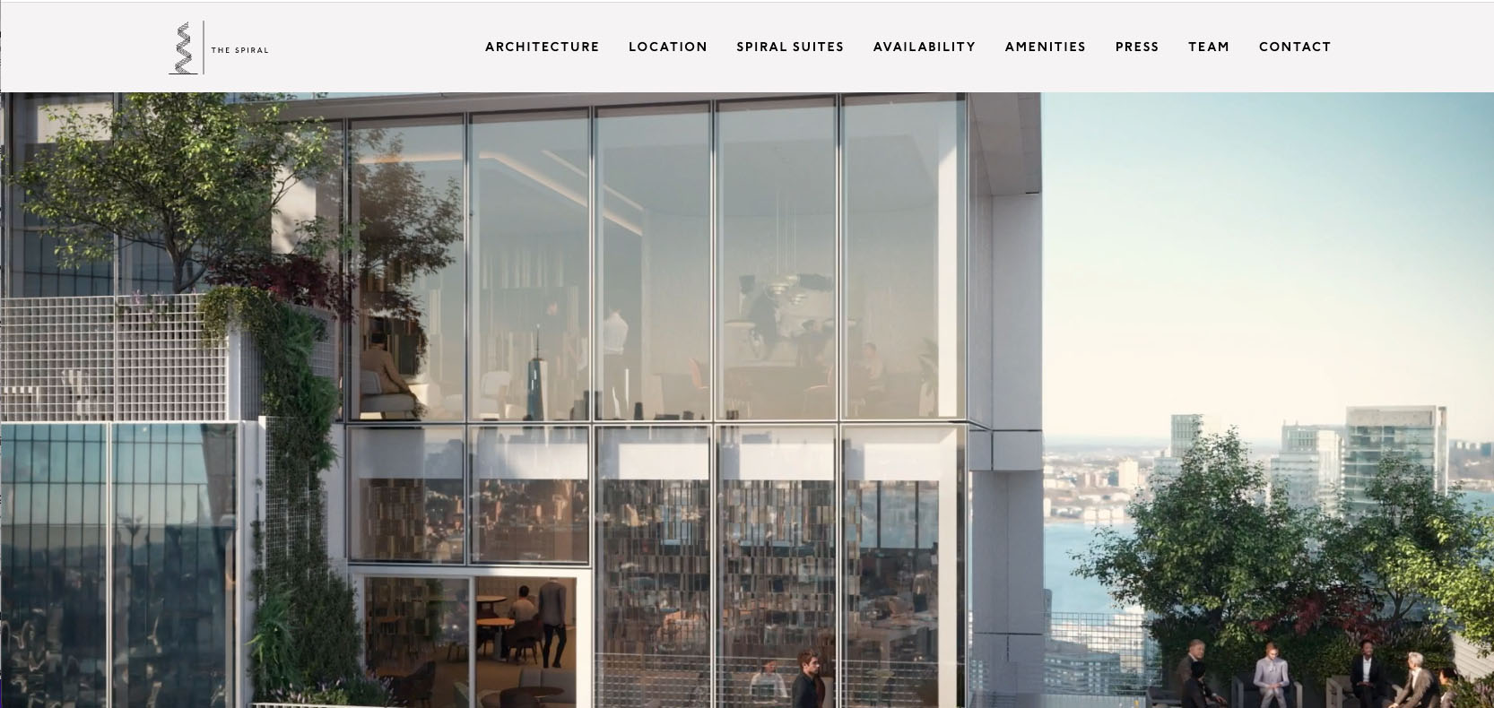
The Spiral is an office building designed with an emphasis on sustainability and integrating nature into the workplace. This single-page website features a full header navigation with jump links that move users up and down the page to new topics, which cover architecture, locations, spiral suites, availability, amenities, press, team, and a contact section.
Architecture / Availability
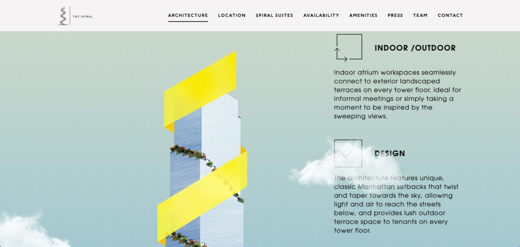
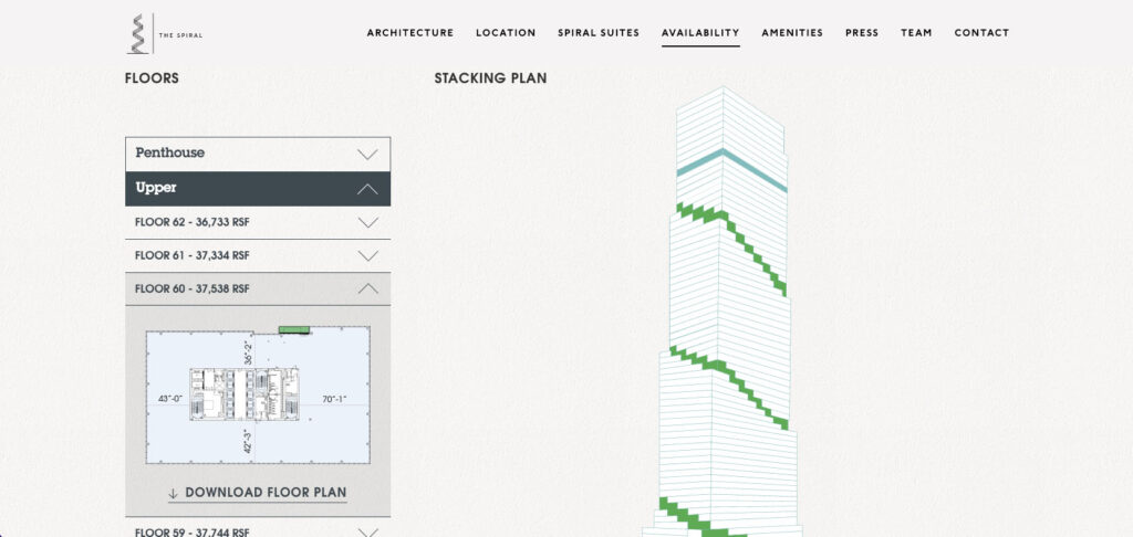
Parallax video effects and custom infographics create an immersive experience designed to retain user’s attention as they navigate through the topics. The Architecture section, for example, has a wrapping yellow graphic around a rendering of the buildings placed next to three key architectural highlights. For a little added fun, you can see slightly transparent clouds that float across the page over the graphics. Another great example of interactive content on this site is the stacking plan that allows users to select which floor they want to view by hovering over sections of the model.
The Spiral’s brand leans heavily on modern design, sustainability, and adaptability. It is described in the following way on their website: “Sustainable by design, built with humans in mind, The Spiral embodies Tishman Speyer’s bold vision and optimism for the future of our City.”

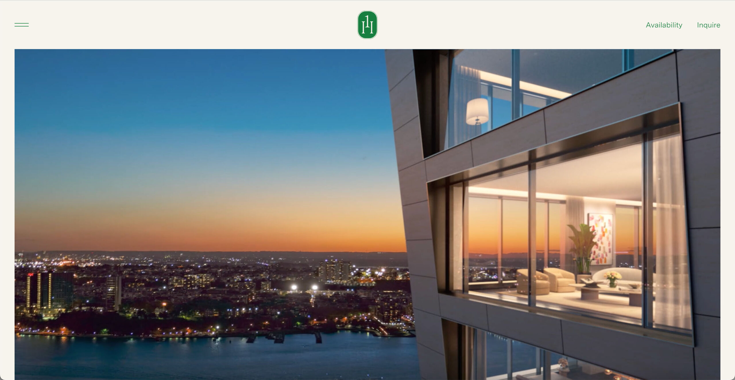
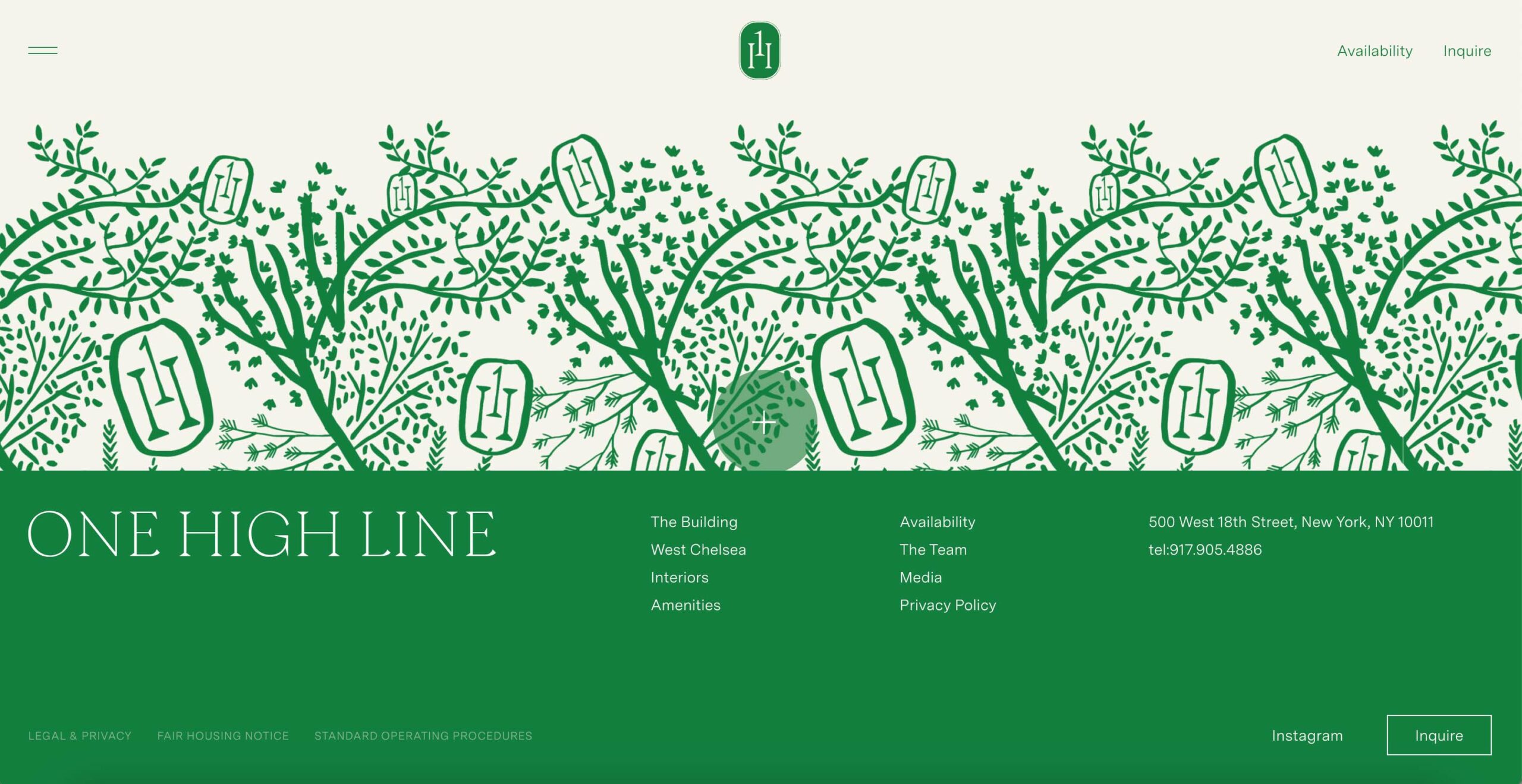
https://www.onehighlineresidences.com/
This site is proof that you don’t have to reinvent the wheel to have an effective website. While none of the content is wildly imaginative, its minimalism and directness work exceptionally well at informing users of what the property has to offer—and it looks great too!
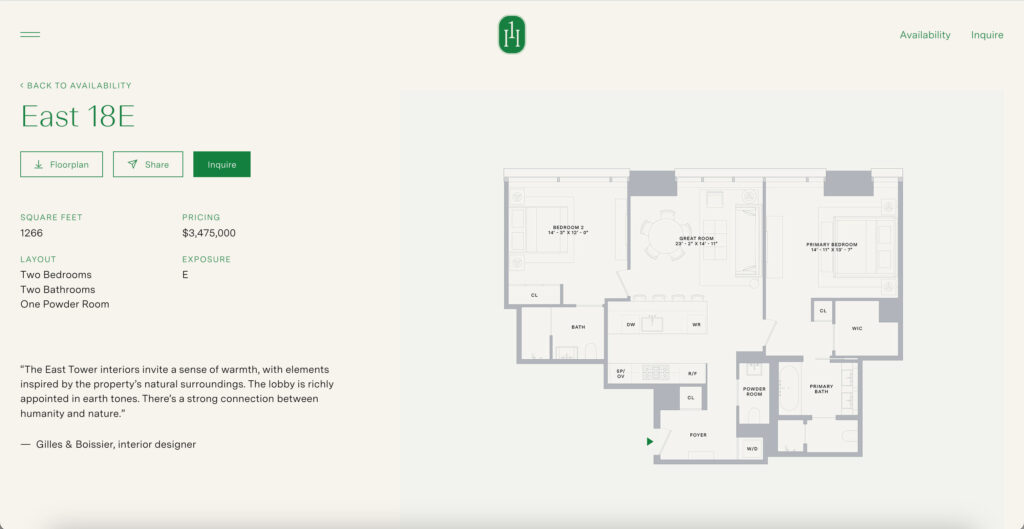
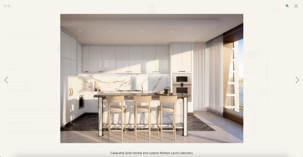
Highlights of this website include the clean, human-readable floor plans—an often overlooked detail on even some of the most impressive real estate websites. They also include an easily navigated gallery of rendering for each type of floor plan.
One High Line’s logo features the number “1” hovering between the two stems of the letter “H,” using the 1’s serif to simulate the H’s crossbar. This is a great example of monogram-style typographic trick that causes viewers to experience what designers often refer to as a “smile in the mind.”
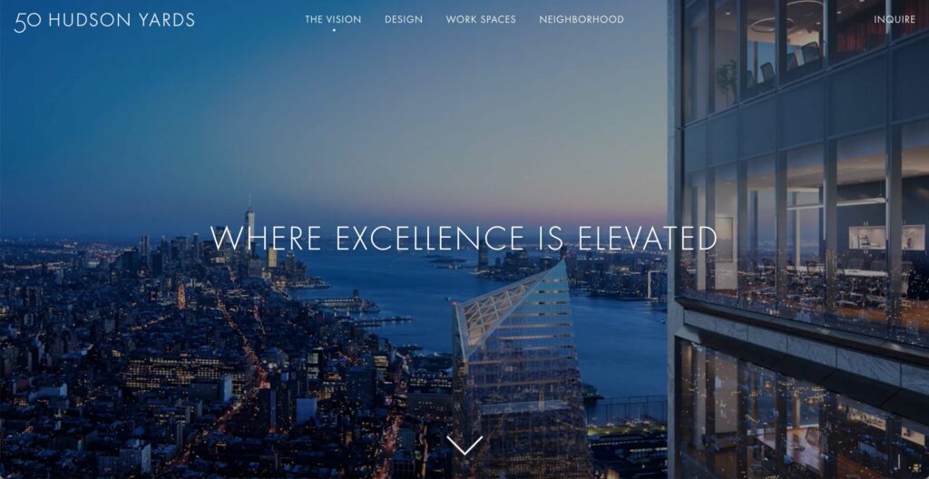
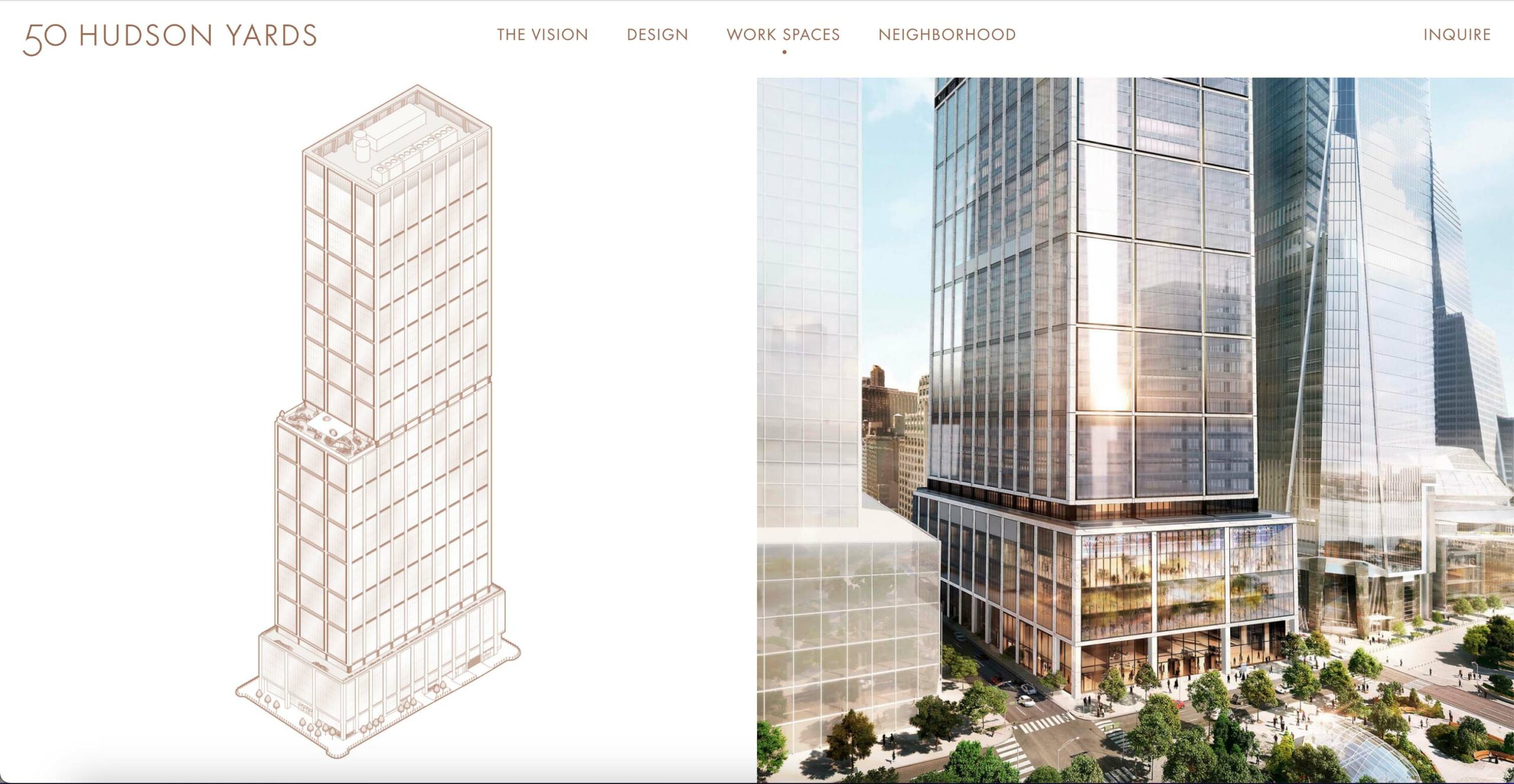
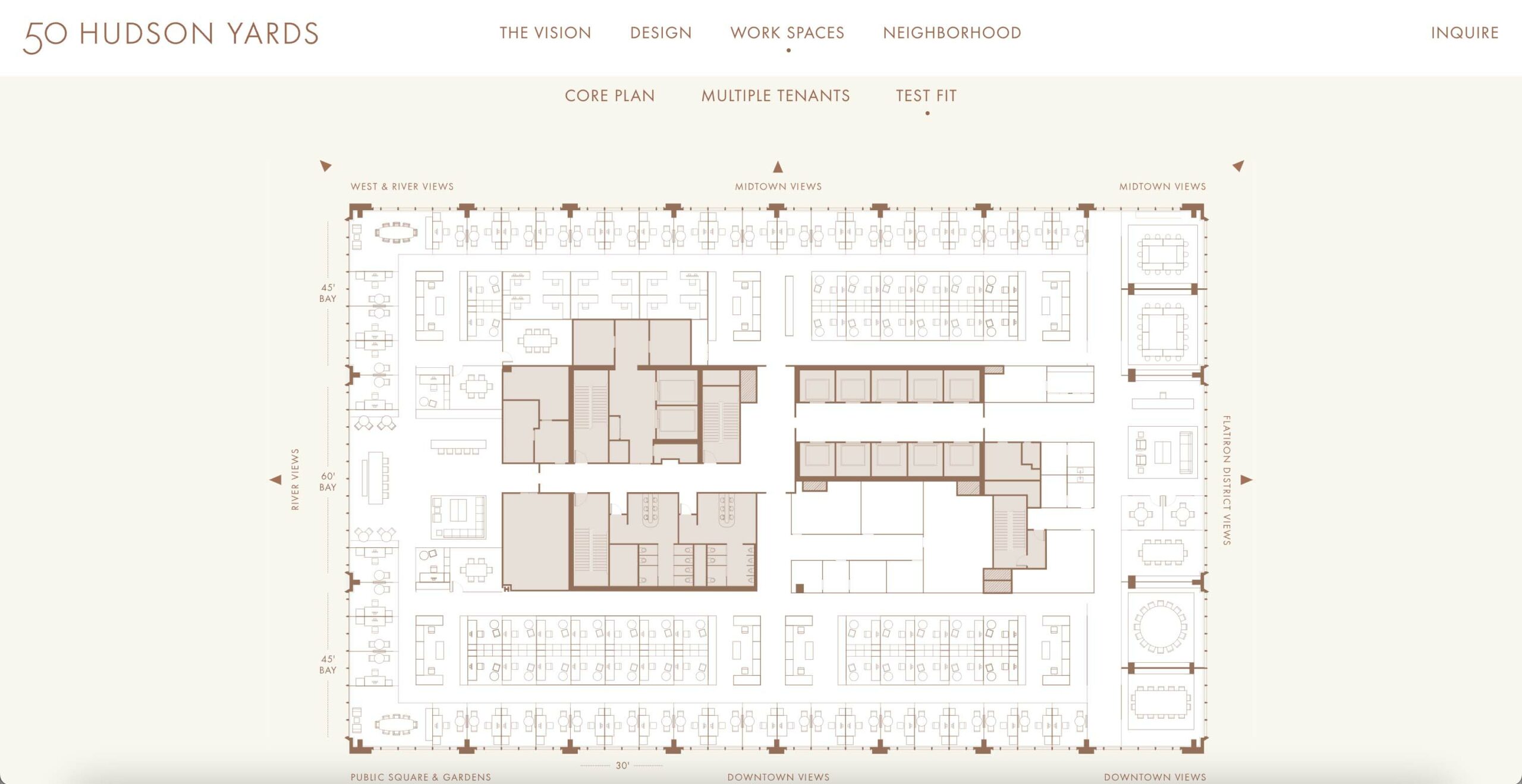
https://www.50hudsonyards.com/
50 Hudson Yards is a commercial development in New York City’s “final frontier” of Hudson Yards. The property’s website features a timelapse of a view next to the building at dusk, with the text, “Where excellence is elevated.” This site, much like One High Line’s, doesn’t reinvent the wheel, but excels in its simplicity that allows the property renderings, photography, and short documentary videos to tell the story.
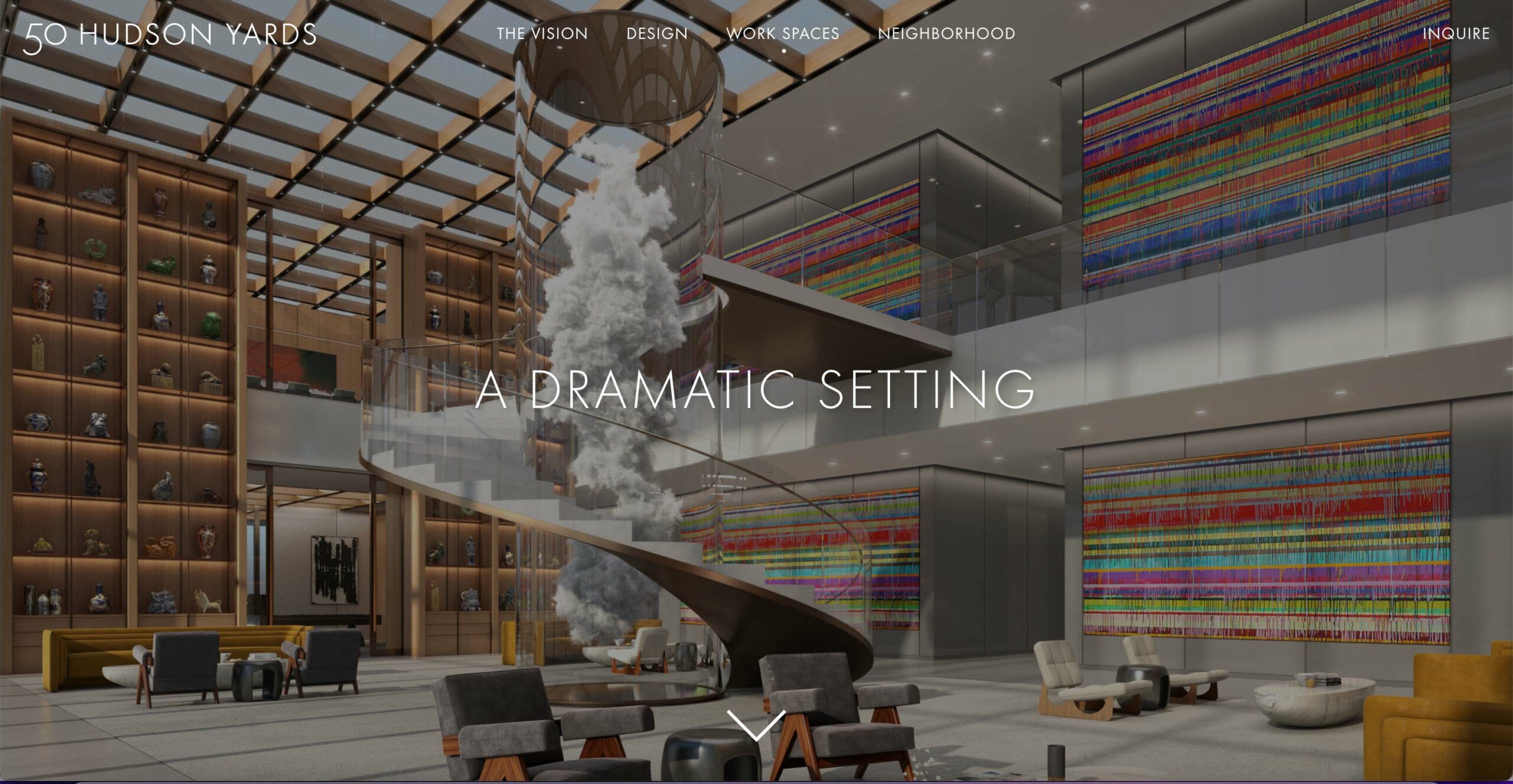
50 Hudson Yards’ brand embodies innovation in the form of timeless luxury. While the property has a simple typeset logo, the visual identity is clearly defined throughout the site, and the luxury experience is present throughout.
“The tower is a masterpiece of modern architecture, engineering and design that stays true to the classic, understated NYC aesthetic, while delivering a visionary new approach to the way we work, now and in the future.”
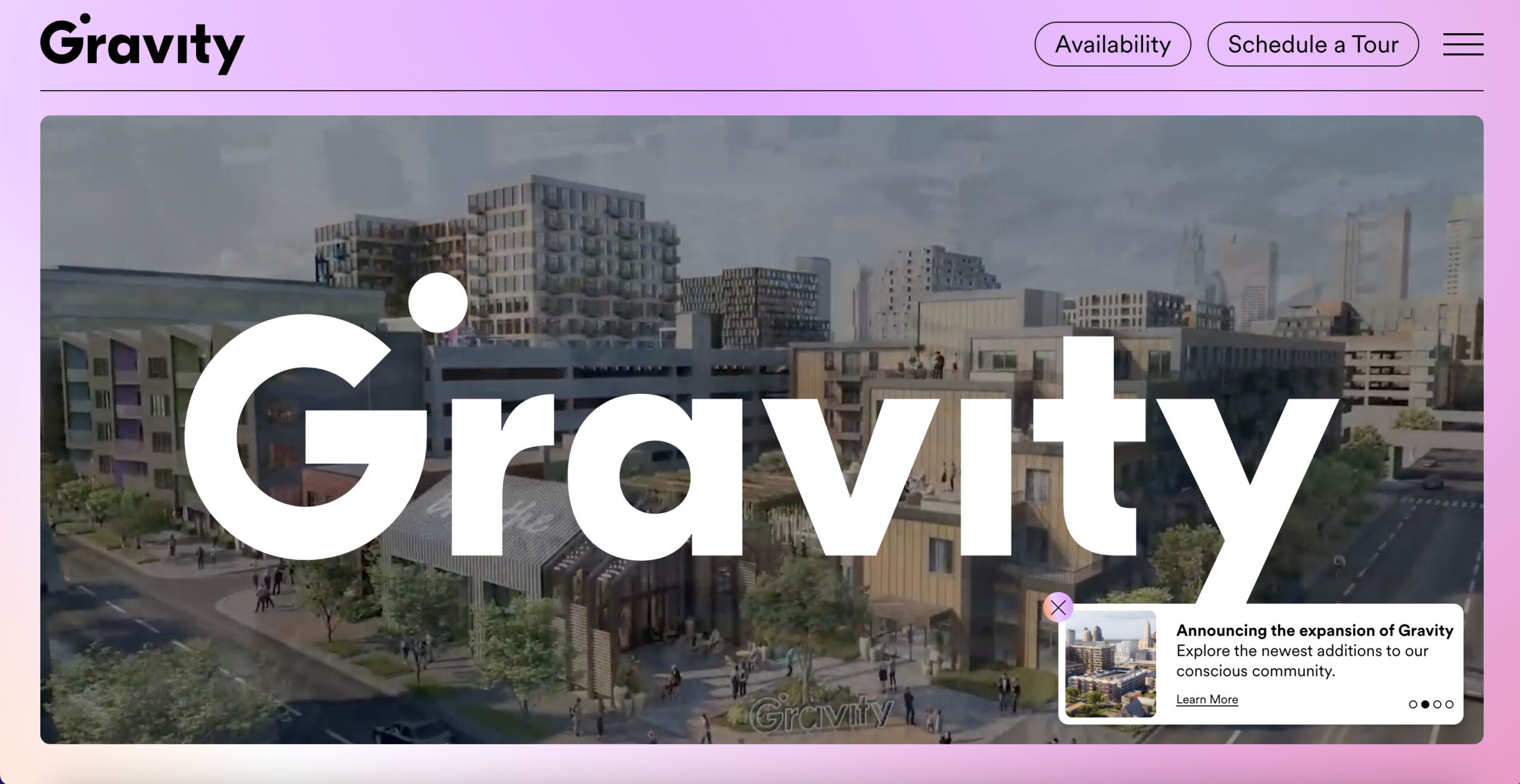
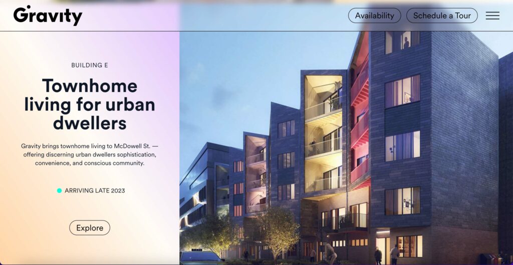
Gravity describes itself as “…the world’s largest conscious community — designed with intentionality, creativity and purpose. Curated to uplift those who choose it for living, working, or exploration.” This is reflected in every aspect of their website from its retro-yet modern aesthetic to its funky scroll effects and color palette. The home page fold is a large video of the community with the logo pasted front and center.
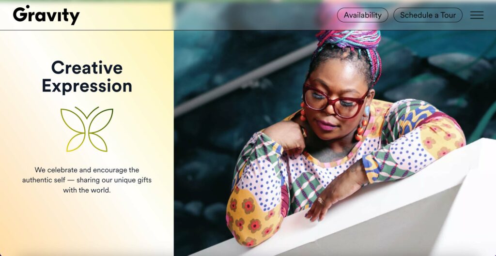
The Gravity brand appears to be heavily targeted toward a Millennial and Gen Z audience—younger people who are open to unconventional lifestyles. This is apparent in the tone and language used in the site’s marketing copy, as well as in the photography which is nearly all people in these age groups. This is not to mention the problems they are trying to solve are based in issues that disproportionately affect this audience in terms of traditional home ownership and flexible work.
Gravity’s logotype is one of my favorite property logos so far. The simple, yet impactful typographic play is a visual metaphor for gravitational pull—taking the tittle of the letter “i” and making it orbit the letter “G” as if it were its satellite.
We have found that major real estate agencies are innovating and adapting to technological advancements to reach a wider, yet often younger audience. As Millennials’ and Gen Z-er’s influence in major decision-making increases, effective digital communication—specifically through agency and property websites is becoming increasingly important. In a modern market where having a website is no longer enough to stand out, companies are innovating in the ways in which they create content for, drive traffic to, and collect data from their websites, making them their most powerful marketing and leasing tool.


 Reopen Form