The Psychology of Branding: How Design Shapes Perception
Introduction
Branding is so much more than a logo—it’s the emotional thread that connects a business to its audience. When done well, branding communicates a sense of identity, trust, and value before a single word is read. Behind every memorable brand is a deliberate use of design psychology, guiding how we perceive, interact with, and remember it.
From the calming effect of a muted color palette to the confidence evoked by strong geometric shapes, brands use visual cues to influence how we feel. In this post, we’ll break down the key psychological principles behind branding—specifically how color, typography, and shapes work together to shape perception and create lasting impressions.
1. Why Psychology Matters in Branding
Psychology plays a central role in how people perceive and connect with a brand. Our brains are wired to process visual information rapidly—within milliseconds, we form first impressions based on color, shape, and typography, often without realizing it. These design choices trigger emotional responses that can influence whether someone feels trust, curiosity, or even hesitation.
Visuals help shape how credible a brand appears and how well it’s remembered. A cohesive, thoughtfully designed brand signals professionalism and consistency, while a disjointed or confusing visual identity can raise doubt. By understanding the science behind perception and emotional triggers, brands can be intentionally designed to connect more deeply and drive action through trust and recognition.
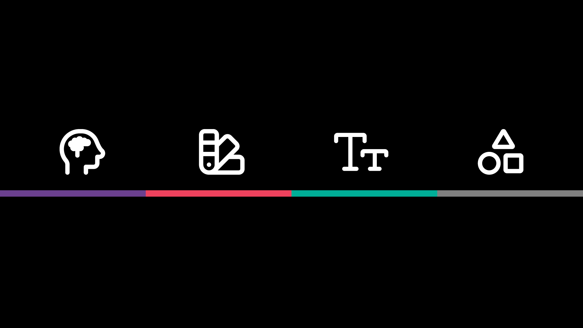
2. Color Psychology in Branding
Color is one of the most powerful tools in branding because it communicates emotion and meaning instantly. Each color evokes a different psychological response—red often signals passion, urgency, or excitement (think Coca-Cola), while blue conveys trust, calm, and professionalism (like Facebook or PayPal). Green is typically associated with health, growth, and sustainability, making it a natural fit for brands like Whole Foods or Spotify.
Choosing the right color palette isn’t just about aesthetics—it’s about aligning with your industry, resonating with your audience, and ensuring accessibility. Financial institutions often lean into blues and neutrals to signal reliability, while children’s brands might use vibrant primaries to feel playful and energetic. Consider your audience’s cultural and emotional associations, and always ensure color contrast supports readability for all users.
3. The Role of Typography in Brand Perception
Typography does more than convey words—it shapes how your brand is perceived at a glance. Fonts carry distinct personalities: serif fonts, like those used by Vogue, feel classic, trustworthy, and authoritative; sans-serif fonts, like Google’s, feel modern, approachable, and clean. Script fonts tend to evoke creativity, elegance, or femininity, making them popular for lifestyle and boutique brands.
Beyond style, typography affects how people engage with your content. Proper hierarchy and spacing improve readability, guide the eye, and subtly influence how information is prioritized. A bold headline paired with legible body text builds trust and keeps attention. Just like color, typography must align with your brand’s voice and values—because whether users realize it or not, they’re forming opinions based on your font choices.
4.Shape and Layout
Shapes have a powerful, often subconscious impact on how people interpret your brand. Geometric shapes—like squares, circles, and triangles—each evoke specific feelings. Squares and rectangles communicate strength, structure, and reliability. Circles suggest unity, community, and harmony. Triangles, depending on their orientation, can convey direction, innovation, or even a sense of urgency or instability.
These associations extend beyond logos. Strategic use of shapes in layouts, buttons, packaging, and iconography reinforces a brand’s personality. A tech company might use angular shapes to convey precision and forward-thinking, while a wellness brand might lean into soft, organic curves to express calm and care. Thoughtful shape selection helps deliver a more cohesive and emotionally resonant brand experience.
5. Bringing It All Together
Branding isn’t just about looking good—it’s about making people feel something. Every visual decision, from the colors you choose to the font in your headline or the shape of a button, plays a role in shaping how your audience perceives your business. By understanding the psychology behind these elements, brands can craft more intentional, emotional connections that resonate and build trust over time.
Whether you’re launching a new brand or refreshing an existing one, grounding your design choices in psychological insight can lead to stronger recall, deeper engagement, and more loyal customers.
6. Common Branding Mistakes to Avoid
Even with the best intentions, brands can lose credibility or connection with their audience by making a few avoidable missteps. One of the most common? Following design trends that look nice in the moment but don’t reflect the brand’s deeper purpose or values—leading to confusion and a lack of recognition over time.
Another pitfall is designing based solely on personal taste rather than considering audience psychology. A brand should speak to its ideal customer, not just its founder. Finally, inconsistency across digital and print materials—like different logo styles, mismatched fonts, or shifting tone—can erode trust and make a brand feel unprofessional or disjointed. Consistency builds confidence; disarray breeds doubt.
Conclusion: Design with Psychology in Mind
The most successful brands don’t just look good—they feel right. That emotional response is no accident. Psychology is the foundation of strong visual branding, shaping how customers perceive, trust, and connect with your business. From color and typography to layout and shape, every design choice plays a role in telling your story.
Being intentional about how your brand looks—and how it makes people feel—isn’t just smart, it’s essential. Ready to build a brand that resonates? Work with a creative team that understands the power of perception.
Related Posts

Branding in 2025: More Than Just a Logo Branding today is so much more than a logo stamped on a business card. It’s a complete experience—shaped by color, tone, typography,…
In recent months, I have been challenging myself to adopt new forms of creative technology, most notably, 3D animation. With the recent rise in Augmented Reality, Virtual Reality, and 3D…
Related Books About Branding
A Smile In The Mind Beryl McAlhone
The Brand Gap Marty Neumeier
Zag Marty Neumeier
Contents

Start a Branding Project
Ready to elevate your brand? Fill out our quick branding inquiry form to schedule your free consultation and discover how our team can transform your vision into reality.