Scalable In Size and Capability
We build powerful yet flexible websites adapting flawlessly to any screen or device, delivering fast loading speeds, optimal performance, and a seamless user experience for every visitor.
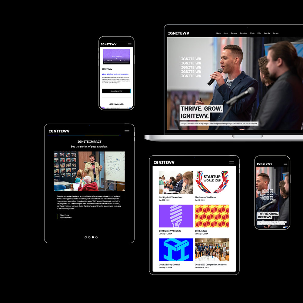
Mobile First
Tablet-first design ensures your website offers a seamless experience for users on mid-sized screens, where portability meets functionality. Our team prioritizes optimizing touch navigation, scaling content, and ensuring clarity for tasks like reading blogs, viewing media, or using interactive features.
Tablet
Our responsive web design ensures seamless functionality on tablet screens, accommodating a growing segment of users who value portability and performance. By optimizing touch navigation and scaling content for mid-sized displays, we create intuitive experiences for tasks like browsing interactive maps, reading blogs, or managing forms on the go.
Desktop
Last but not least, desktop layouts offer robust content display and unparalleled flexibility, allowing for immersive layouts and enhanced functionality. Our approach ensures your website takes full advantage of larger screens to showcase detailed visuals, organize complex information, and deliver a comprehensive user experience.
Versatile
Frameworks
We leverage Bootstrap alongside WordPress and ACF tools to create dynamic, versatile content blocks that adapt seamlessly to any device, ensuring an optimal viewing experience for all users.
Cross-Browser Compatible
Our component libraries undergo rigorous testing and are meticulously maintained by our team of web design and development experts to ensure flawless performance across all major browsers.
Sustainable
Solutions
We prioritize using open-source and industry-leading frameworks to build tools that provide long-lasting, scalable solutions, designed to grow alongside your business needs.