7 Examples of Single Property Real Estate Websites
Written by:
Zane Huggins
In our last blog post, I discussed how building a website to showcase a single property can be an incredibly powerful marketing tool capable of giving users a uniquely immersive experience as to the type of lifestyle the property provides to its occupants. In this post, we explore a few of our favorite single property real estate websites.
The Brooklyn Tower
Property By: https://jdsdevelopment.com/
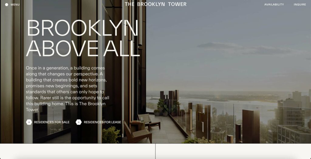
This website showcases the stunning Brooklyn Tower, a luxury high-rise residential development. The site has a “vision video” which tells the story of the building, its features, and its amenities. An in-depth amenities section is found at the bottom of the home page, organized by category in a user-friendly, tabbed navigation layout.
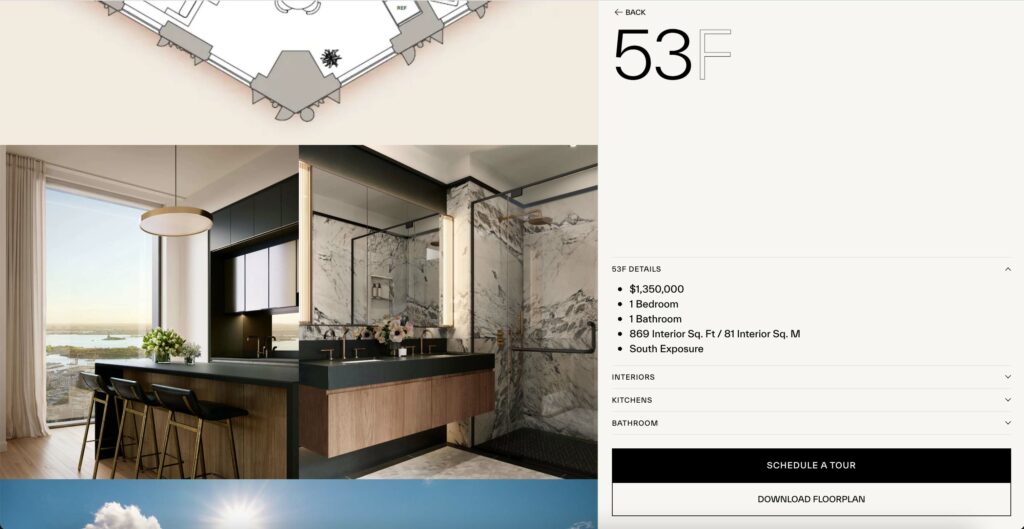
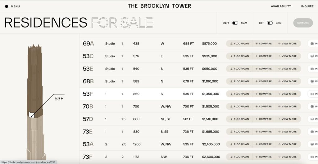
The most exciting part of the website is the availability and listings section. When you hover over a listing, it pinpoints where that specific unit is located in the building via an exterior rendering. After clicking “View More,” you are brought to the unit’s page where you can view renderings, specs and details, and also see what your view out the window will look like.
50 West
Property By: http://www.thomasjuulhansen.com/
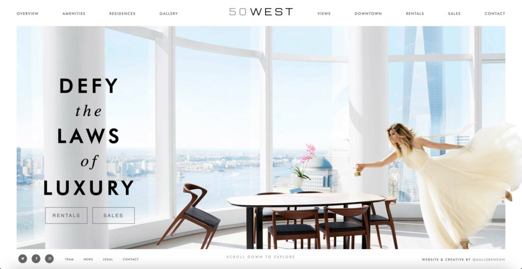
50 West is a luxury high-rise condo building in lower Manhattan with incredible views of the Hudson River, the World Trade Center, and Jersey City. This single property website features all of these views and more using beautifully crafted parallax scroll animations where items in each photo appear lift away—a nod to the heading, “Defy the laws of luxury.”
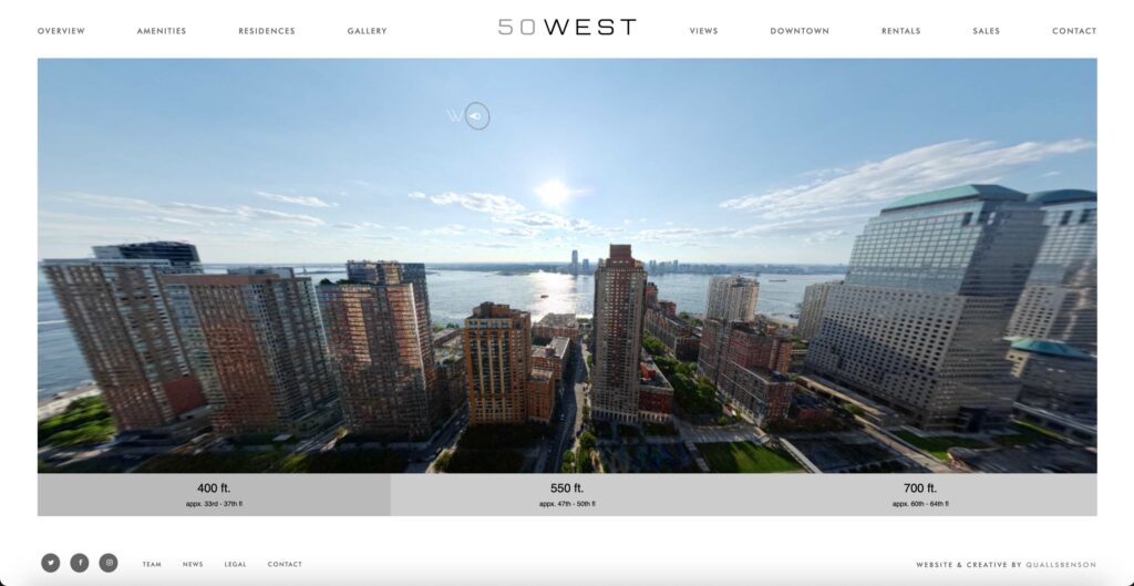
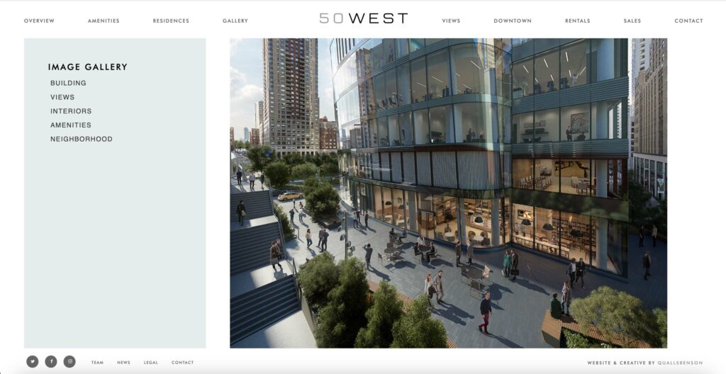
Other key elements of this website include the panoramic view from various heights in the building, as well as the image gallery, which features everythign from the buildings interior and exterior to the neighborhood amenities.
All of this great information is packaged in an attractive, minimalistic aesthetic, allowing for ease of navigation, and most importantly, allowing the story of the property to take the center stage.
111 West 57
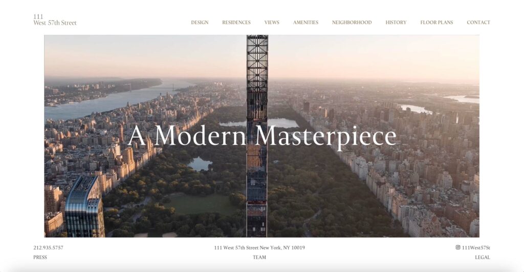
111 West 57 is part of what is commonly referred to as “Billionaire’s Row.” This property’s website, much like 50 West, adheres to a minimalistic aesthetic that lets the property itself take the center of attention.
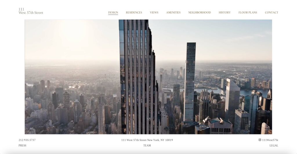
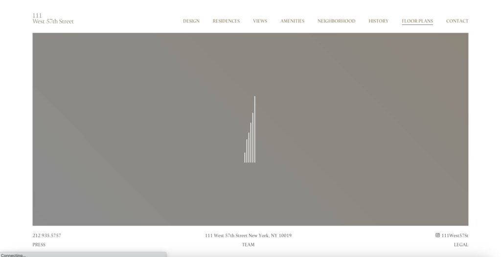
While this site isn’t packed with scroll effects and flashy tech features, the simplicity and understated attention to detail are what make it a magnificent experience. For example, the loading bars (3rd image) are arranged to resemble the building’s exterior shape. It is often said that “great design is invisible,” which is the case with 111 West 57’s website.
LCD Poklonnaya 9
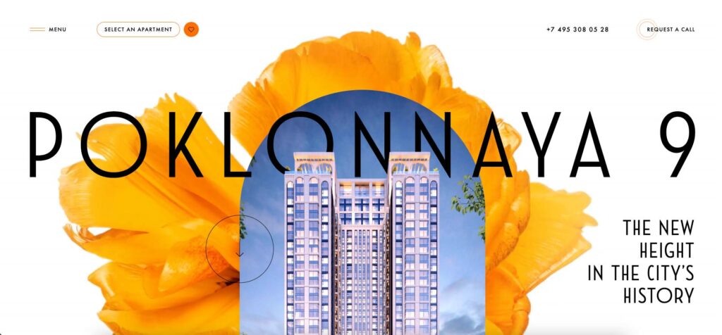
This website is the absolute opposite of the past few examples—but perhaps just as successful! This site, for an apartment complex with a hotel section, based in Moscow, is packed with scroll effects, and javascript bells and whistles. While it isn’t quite a navigable as the other examples, it succeeds in immersing visitors in a brand experience totally unique to their property, and leaves a lasting impression.
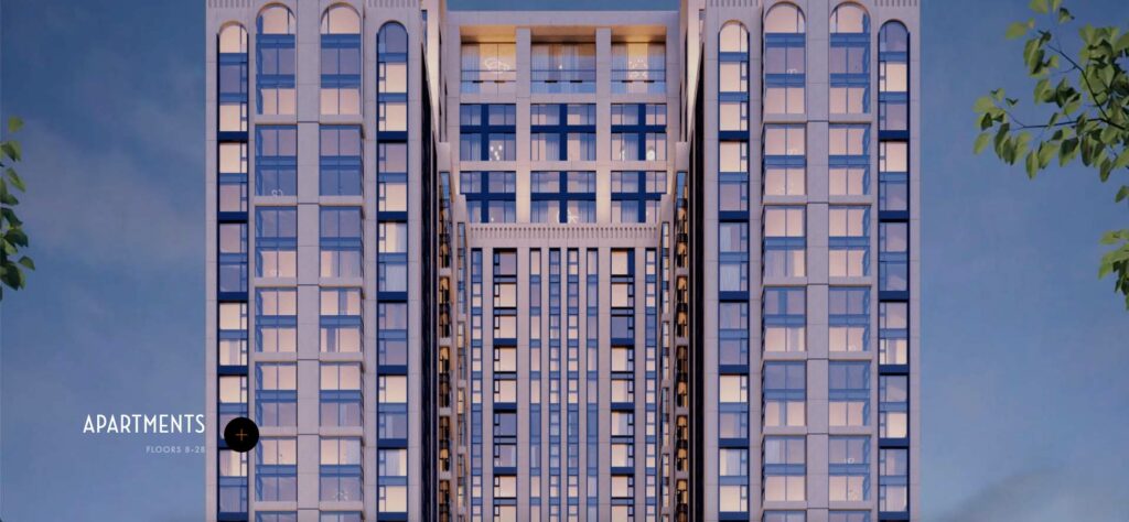

As you scroll down the homepage beyond the gorgeous opening animations, you will notice that key areas of the building are labelled by section. Upon hovering on the icon, it expands to elaborate on the details of that particular section.
Perhaps the most interesting feature is the sense of depth created by the layout’s overlapping elements. Where the site lacks in easy navigation, it makes up for highly engaging storytelling and immersive brand experiences sprinkled throughout each page. It’s safe to say that there are no bulleted lists—they implement infographics and interactive elements at every turn.
432 Park Ave.
https://www.432parkavenue.com/
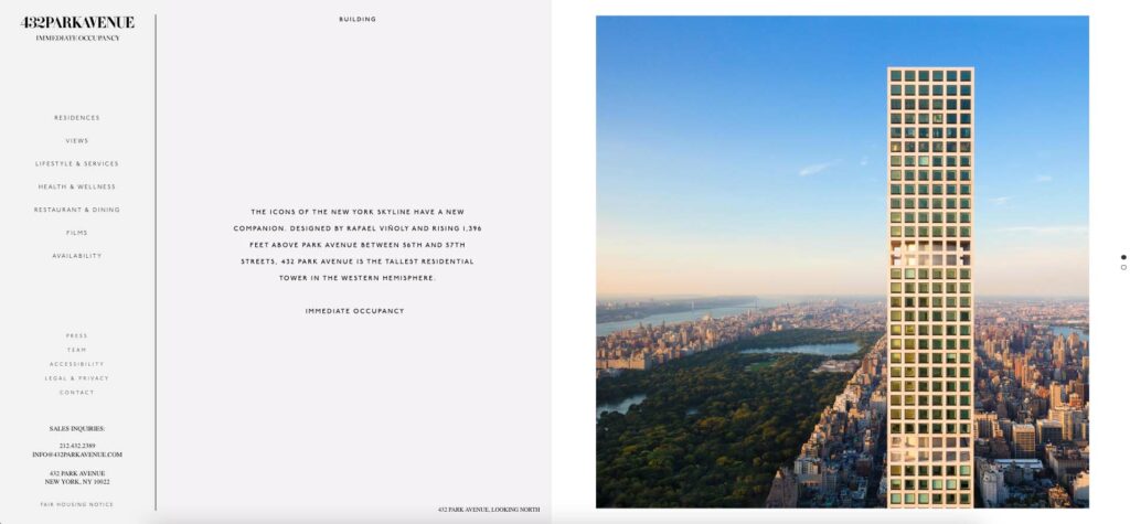
Back to the minimalist aesthetic! 432 Park Avenue’s website features a side-navigation, a text area, and an image section, giving it a similar aesthetic to a luxury magazine spread. Filled with beautiful, light photography that showcases the “billionaire’s row” skyscraper’s most luxurious features, the minimalist aesthetic, once again, allows the photos and text to tell the property’s story with little distraction.
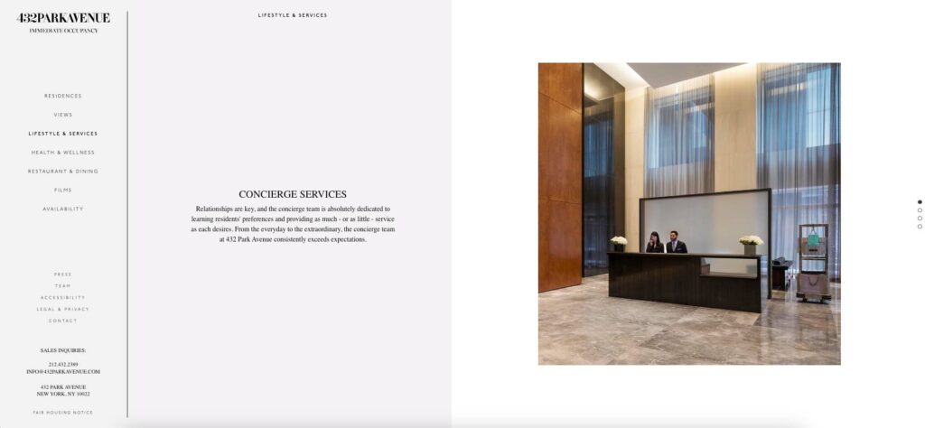
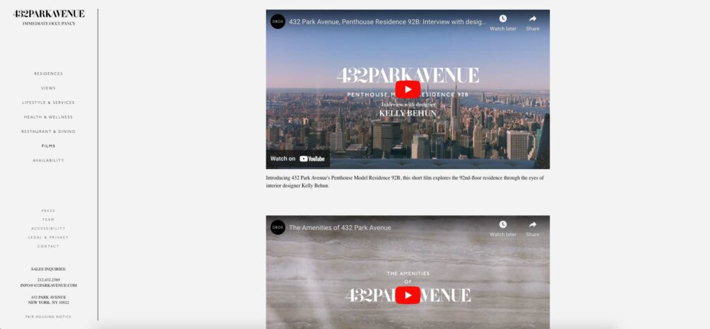
The side-navigation is helpful as you can always see which page you are on, unlike when a menu is hidden behind a toggle button in one of the top corners (see LCD Poklonnaya 9). To add to the ease of navigation, each page is layed out similarly, allowing you to quickly learn the behavior of the site. The only downside to the site: the snap scroll effect doesn’t always work as expected.
Lastly, like most of the websites on this list, the site houses videos showcasing various aspects of the property.
Lever House
https://www.leverhousenyc.com/
Property By: https://www.brookfield.com/our-businesses/real-estate
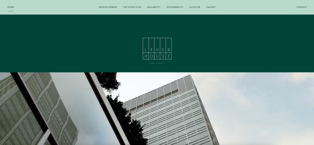
Lever House is a redevelopment project, updating NYC’s first all-glass office building. This website lands perfectly in the middle of the minimalism to surrealism spectrum that we have explored so far! As you scroll down the page, the content’s entrance is animated into view in a delightfully unobstructed way—enough to make you want to scroll up and down just for fun.
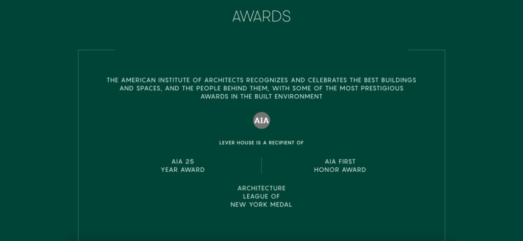
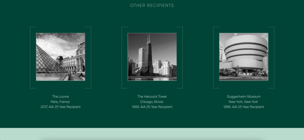
On the homepage, you will find a list of awards received by the property. Following the list, is another list of other recipients of the awards. I thought this was very clever, as if you are unfamiliar with the awards, you see these very famous buildings, establishing the prestigious titles held by Lever House.
111 Montgomery
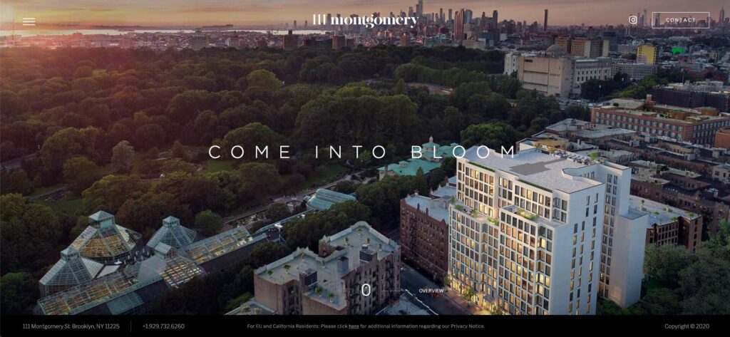
The single property website for 111 Montgomery features plant-centric branding, emphasizing outdoors, fresh air, and sunlight. This paired with clean, bright photography and renderings stage the property as an attractive place to live, with plenty of outdoor amenities.
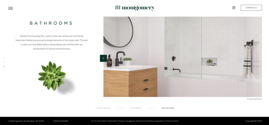
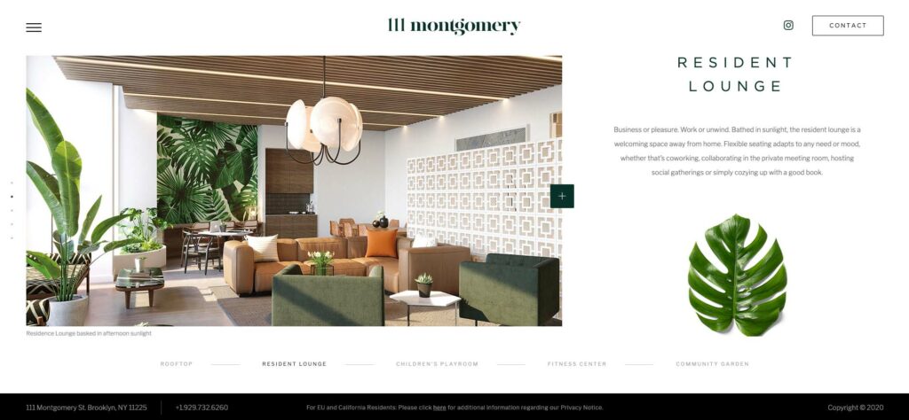
Each page is broken into full-screen sections which focus on one key element, and is accented with a matching plant to accompany the image. Complete with a video library, nearly all of which feature outdoor spaces, this site positions this property as place for wellness with easy access to the outdoors. This is all achieved using fairly minimalistic layouts, with just enough metaphorical graphic elements to tell a compelling story. The only downside: as often happens, the snap scroll is very buggy!
Related Blog Posts
Introduction The New York City real estate industry represents one of the most vibrant and competitive markets globally, characterized by diverse property types, iconic landmarks, and dynamic economic factors, driving…
Single Property Websites: Our Favorite Five We recently shared a list of single property websites that serve as powerful tools for agencies to lease their buildings. Since then, we have…
