3 Logo Mistakes That Kill Your Brand Recognition (And How To Avoid Them)
Zane Huggins | 06/23/23
Zane Huggins | 06/23/23
A company’s logo is key to brand awareness, recognition, and eventually loyalty. While your logo is only one piece of the puzzle, it is the number one visual identifier your audience will use to differentiate your brand from your competitors. Keep reading to learn about these three common mistakes that kill your brand recognition.
Over the past few years in the industry, I have noticed a few trends that kill brand recognition during the discovery phase of logo and visual identity projects that I believe are important to address. These brand recognition-killing trends range information overload to thinking too literally and missing the opportunity to include visual metaphors and clever cues that create what designers call a “smile in the mind.”

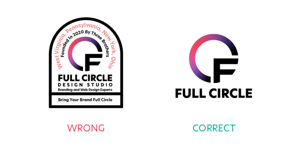
Too often, we see new brands commit the crime of information overload. Successful brands do not do this. Your logo, while the most important component of your visual identity, should not be used to tell your brand’s entire story. As the face of your brand, it should be simple, recognizable, unique, and introduce who you are. If your brand were a book, the logo would be the title, the visual identity would be the front and back cover, and your brand would be the story inside.
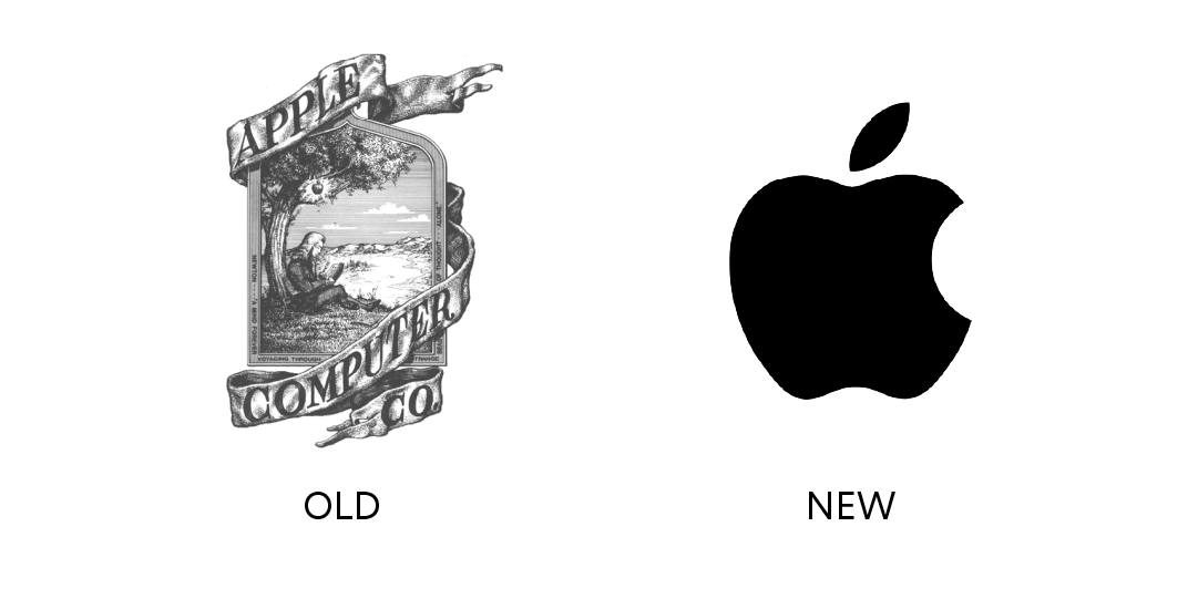
Telling the whole story up front may sound like a great idea, but what it actually does is cause information overload. Take Apple for example, its logo started out as an intricate illustration with too much text, and too much detail for it to be easily identified in passing:
Tip: Use the 5 Second Rule, It doesn’t just apply to eating food off the floor!
As part of my visual identity workshops, I present three variations of a logo side-by-side for only five seconds and then have the client’s team redraw each on a sheet of paper. If one option is redrawn most accurately by a majority of participants, it is a good indication that it will be a recognizable and impactful logo.
Understand that your logo is not your brand, it is just one visual component. Take a step back and think about how your logo exists and interacts with a larger identity system that will help to shape your entire brand story—this responsibility doesn’t belong solely to a logo. Remove redundant information—save it for your taglines, marketing copy, mission statement, vision statements and remaining elements of your visual identity such as photography, iconography, typography and patterns/illustrations.
Fun Story:
Back when I worked in Pittsburgh, I would always pass vans on the highway for a heating and cooling company that had a logo that looked like it had flying pieces of poop and a volcano on it. This logo was printed on all their vans and every time they drove by I tried to decipher what the flying pieces of poop actually were. One day I rubber-necked so much to get a good look at it that I nearly drove into the other lane and caused an accident. The logo had way too much detail and was a traffic hazard—and I NEVER found out what the poop actually was.
This is the second trap we see ensnare well-intentioned brands, and shares a lot of the common pitfalls of “telling the entire story.” Many brands ask for an icon of the item they produce as their logo. This becomes problematic for a brand very quickly, because as soon as the logo is printed on a decal, or even more permanent, engraved on your product, you begin to notice your logo is just a smaller image of the item you are selling—not very memorable—and even worse, not very scalable!
Let’s look at a few examples:
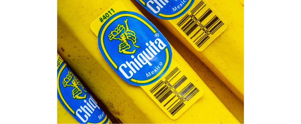
Chiquita does not have a banana icon as their logo. They also don’t go into too much detail in illustrating the fruit in the lady’s hat. This vibrant mascot who appears to be dancing gives the brand a lot more personality than a banana icon! And they certainly don’t mention anything about the details of their business in the logo—such as the fact that they pay off violent militias to leave their crops alone. They keep it simple, friendly, and recognizable.
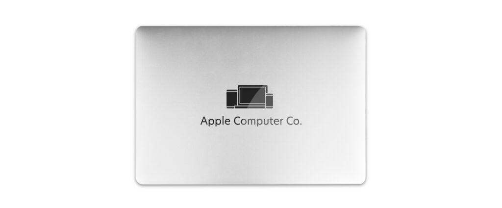
Apple’s logo (Apple is my gold standard for branding), is an apple. Which is an icon of their name—so you can make an argument that in that regard, it is literal. But what it’s not, is a computer, an iPhone, an iPod, or any of their other products. This is a very good thing, because if their logo was a vector icon of their products, they would have to change their logo every few years, which is a huge brand recognition killer! Also, wouldn’t it look weird to carry around a phone with an icon of a phone on it? Or a laptop with an icon of a laptop on it? Or a phone with an icon of a laptop on it? Have I given enough reason to not make your products your logo?
Use visual metaphors, allow room for a healthy amount of ambiguity, and be clever! If your logo gives your audience a clever puzzle to solve in the form of a visual metaphor you are creating a
“smile in the mind” and will make an instantly memorable experience and leave a lasting impression.
The entire point of a logo is to provide your audience with a visual mark to identify and differentiate your brand from your competitors. If your logo looks identical to your competitors, it can be mistaken for their brands, or be perceived as a knock-off, or simply be dismissed as unremarkable and and remain unrecognizable to your intended audience. Here are a few examples of logos that I find to be mistakable for the logos of their competitors—regardless of how good their products may be.
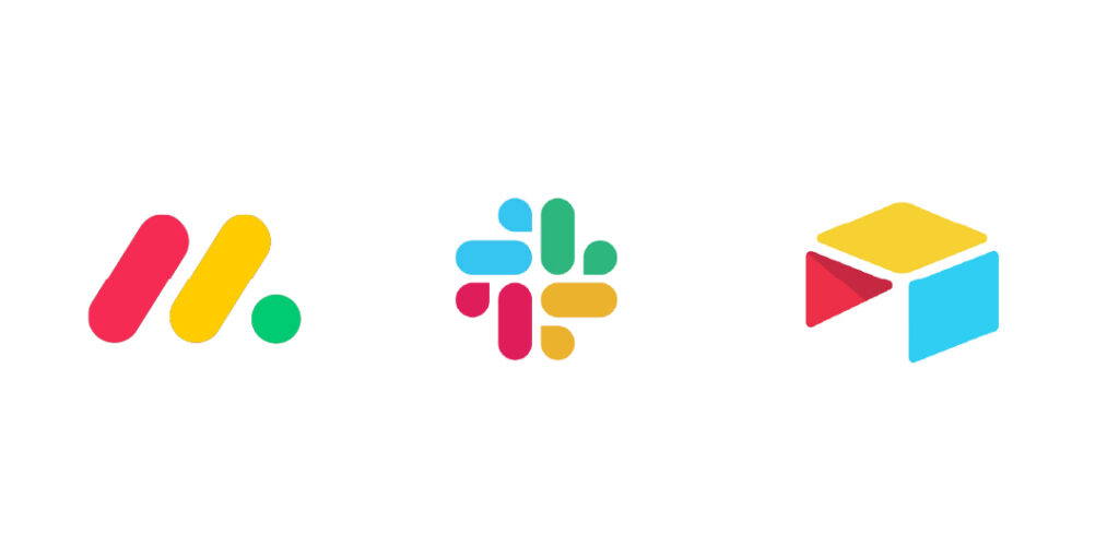
The problem: They all look like they belong to Google (see Google app icons below)
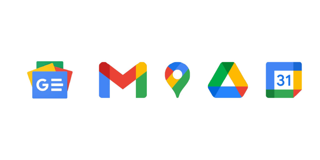
As stated above, if your logo is perceived as unremarkable, or is even unrecognizable when compared to your competitors, you risk losing market share to them. Sameness is not good as it is typically equated to being either a “knock-off” or a mediocre product or service. And while your logo may not break your brand—it is one of the key building blocks to a successful brand.
Hire a good designer who does market research. There is a delicate balance between relatability and uniqueness that has to be approached carefully through research and understanding of what is trending, which trends historically have withstood the test of time, and which ones will be fleeting and gone in just a short period of time.
There is one more underlying issue that can lead to logo “sameness” which is brand “sameness.” In order to create an impactful logo, you need to be able to identify what differentiates your organization from your competitors. What is your unique perspective and offering? What are you providing to your customers that they can’t get anywhere else? Being able to answer these questions will help guide your logo design process and yield results that can help build brand awareness, trust, and loyalty, and significantly grow your business.
This list of common logo mistakes can have detrimental effects on your brand and business, but the good news is that they are easily avoidable! The best defense you have against any of these pitfalls is to do your research, and hire an experienced designer who is experienced in researching industry trends, both recent and historical to make sure your logo becomes a long term, sustainable solution for your brand that drives recognition, which will lead to trust and loyalty among your customers.
Is your organization struggling with brand recognition? Schedule a free consultation with our team to bring your brand Full Circle with our expert brand strategy services.