- Portfolio
- Diamond Ridge
Diamond Ridge: Commercial Real Estate Branding
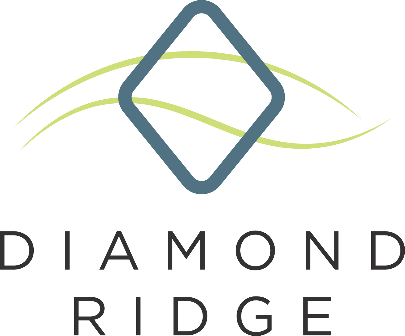
For Diamond Ridge, a commercial office development near Pittsburgh, PA, we designed the entire visual identity system and marketing tools, centering on a logo featuring a diamond contrasted with organic hill-like shapes. This design symbolizes the developers’ vision of merging workspaces with nature through outdoor spaces and walking trails, capturing the essence of a harmonious, productive environment.
Timeline: Spring 2021
Role: Branding + UI/UX Consultancy
Client: Burns Scalo Real Estate
Black
#333132
Dark Blue
#507282
Sea Foam
#74a7a2
Green
#cddf76
Brick
#b25538
Branding
We created Diamond Ridge’s branding as a pivot from Burns Scalo Real Estate’s agency brand. The logo is a nod to the parent brand’s logo, which features two diamonds. In addition to its subtle references to the parent brand, it is designed to merge the geometry of modern architecture with the organic landscape of Pennsylvania’s rolling hills.
By including different tones of the parent brand’s palette into Diamond Ridge’s, and using the same primary font, we achieved a balance between familiarity and uniqueness that allows the brand to exist harmoniously in Burns Scalo Real Estate’s portfolio.
Related Reading:
Commercial Real Estate Branding
