The Concorde: Commercial Real Estate Branding
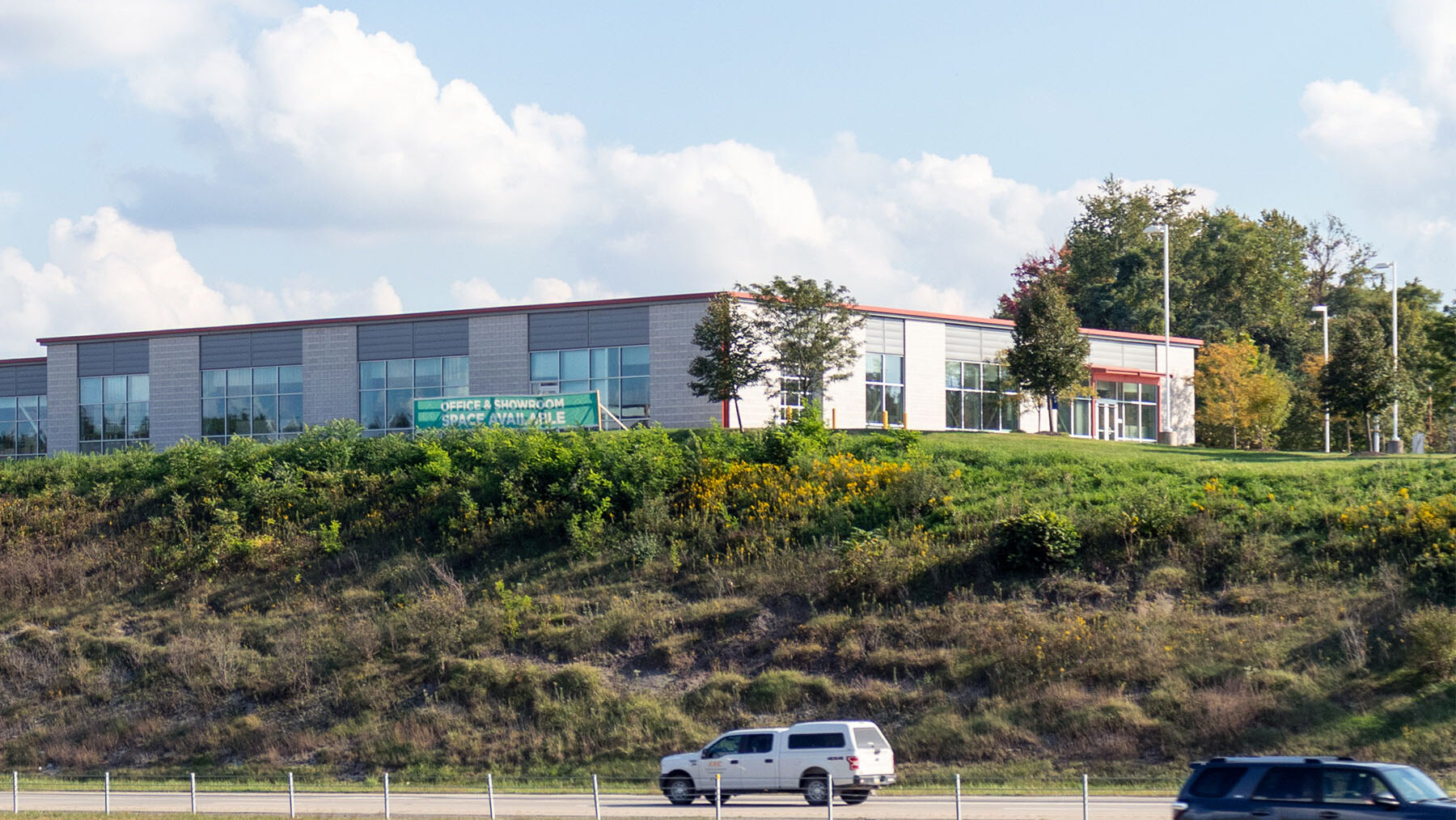
We branded The Concorde commercial office space, named after the aircraft and reflecting its proximity to the Pittsburgh International Airport, with a sleek, minimalistic identity that emphasizes simplicity. The bright red colors, inspired by the building's exterior trims, add a distinctive touch without overwhelming graphic elements, aligning perfectly with the property's flexible usage and non-retail focus.
Timeline: 2022
Role: Branding + UI/UX Consultancy
Client: Burns Scalo Real Estate
Red
#ac2b1b
Dark Gray
#58595b
Medium Gray 1
#808285
Medium Gray 2
#bcbec0
Light Gray
#f1f2f2
Brand + Identity
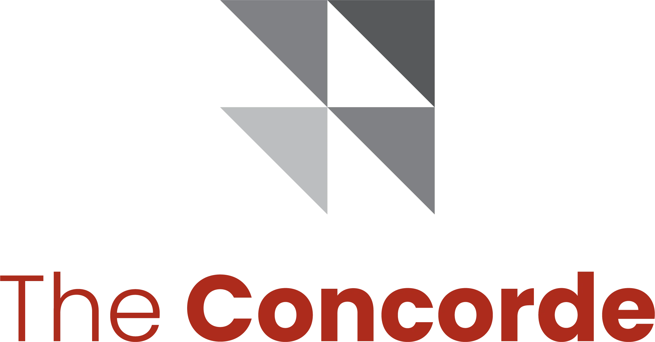
The logo for The Concorde features a series of four right triangles aligned to form a square outer frame, with each diagonal row of triangles filled in progressively lighter shades of gray. This design element suggests movement and dynamism, evoking the image of a plane taking off. Pairing this logo with a clean, industrial-like yet friendly font family, Poppins, The Concorde's brand identity unifies the messaging for the property and its marketing materials.


Related Reading:
Commercial Real Estate Branding
Introduction The New York City real estate industry represents one of the most vibrant and competitive markets globally, characterized by diverse property types, iconic landmarks, and dynamic economic factors, driving…
Single Property Websites: Our Favorite Five We recently shared a list of single property websites that serve as powerful tools for agencies to lease their buildings. Since then, we have…